 logo
logo



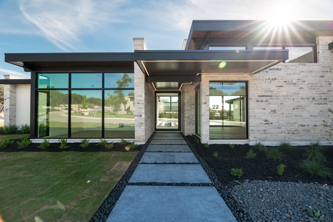
For home builders, a website is more than a digital brochure. It is often the first model home a buyer experiences, the first conversation with a hesitant lead, and the first proof that your company can turn a vision into a place to live. As buyers research communities, floor plans, financing, timelines, and design options online, your site needs to feel as polished and trustworthy as the homes you build.
TLDR: Home builder websites should focus on visual storytelling, speed, personalization, and easy lead generation. The strongest sites combine beautiful imagery with practical tools like interactive floor plans, virtual tours, clear calls to action, and localized content. Modern design trends also emphasize trust, accessibility, mobile performance, and a smoother buyer journey from curiosity to consultation.
1. Immersive Visual Storytelling
Home building is an emotional purchase, so your website should help visitors imagine a future lifestyle, not simply view square footage. Large-format photography, cinematic video headers, and carefully curated project galleries can make a builder’s work feel tangible and aspirational.
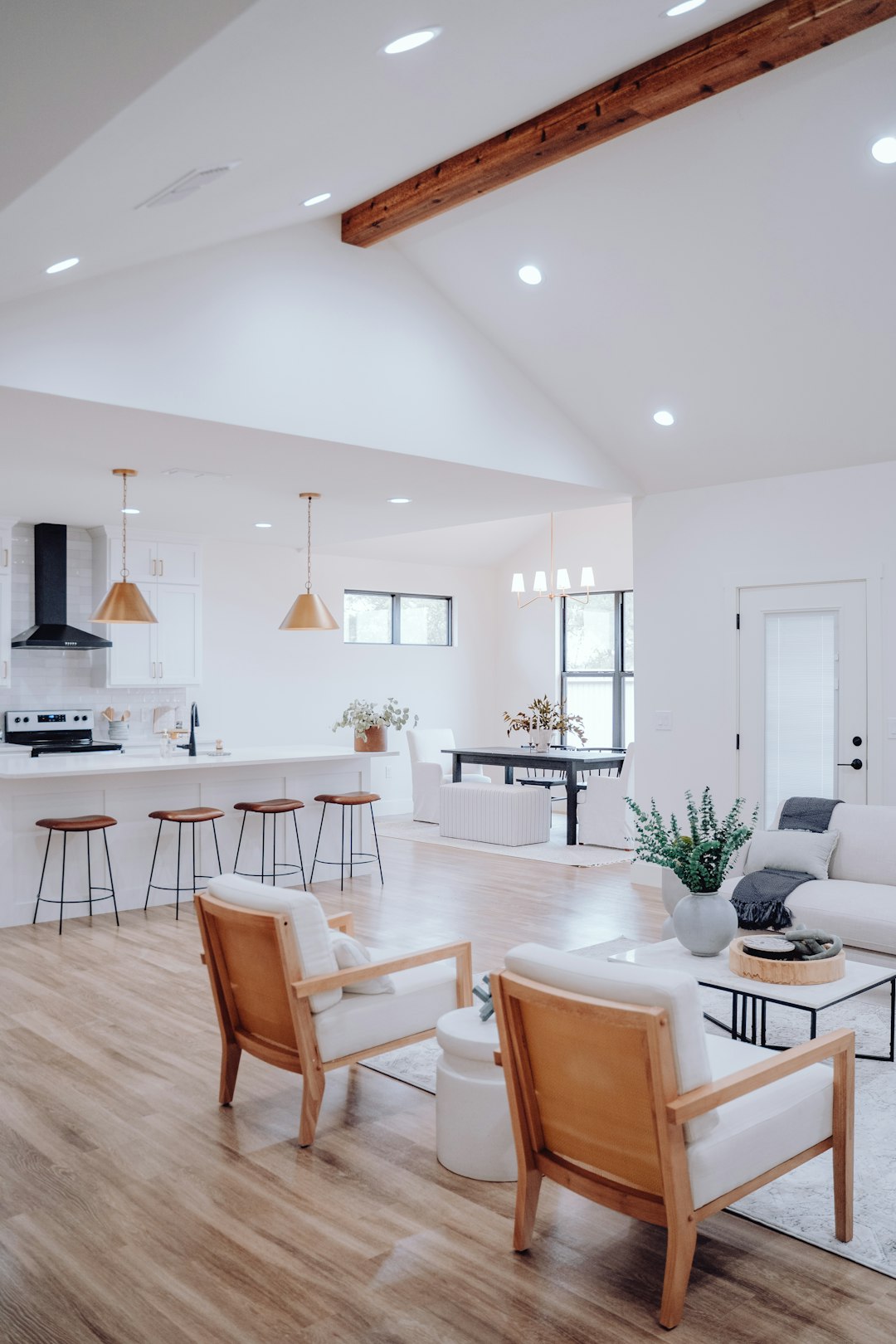
Instead of showing only empty rooms, consider lifestyle photography: a kitchen prepared for entertaining, a family room with natural light, or an outdoor living area at sunset. Pair these visuals with short, meaningful captions that explain the design choices, materials, or custom features. This gives buyers both inspiration and information.
2. Interactive Floor Plans and Home Customization Tools
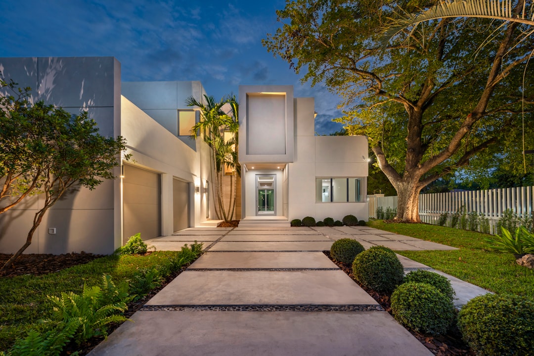
Static floor plan PDFs still have a place, but buyers increasingly expect a more dynamic experience. Interactive floor plans allow visitors to click through rooms, view dimensions, compare layouts, and understand how a home flows. Some builders also offer customization features, such as choosing exterior elevations, cabinet finishes, flooring, or optional room conversions.
These tools are especially valuable because they keep users engaged longer and help them feel ownership before they ever speak to a sales representative. A prospect who spends ten minutes customizing a home is more invested than one who simply scrolls past a gallery.
- Clickable room labels that explain size and purpose
- Elevation comparisons for different exterior styles
- Options toggles for bonus rooms, offices, or expanded patios
- Save or share features that encourage follow-up conversations
3. Virtual Tours and 3D Walkthroughs
Virtual tours have moved from novelty to expectation, especially for relocation buyers or busy families who want to narrow their options before scheduling an in-person visit. A strong 3D walkthrough can make a model home available 24 hours a day, giving prospects the freedom to explore at their own pace.
For custom builders, virtual tours can also showcase completed projects and demonstrate craftsmanship. Highlight details such as stair railings, built-ins, ceiling treatments, and material transitions. These small moments often communicate quality better than broad claims like “luxury finishes.”
4. Mobile First Design
Many home buyers discover builders through mobile search, social media, map listings, or shared links from family members. If your website looks beautiful on desktop but feels cramped, slow, or difficult on a phone, you may lose leads before they ever see your best work.
A mobile-first site uses simple navigation, fast-loading images, readable text, and thumb-friendly buttons. Key actions should be obvious: view floor plans, schedule a tour, request pricing, and contact a consultant. Forms should be short, with minimal required fields, because mobile users rarely want to complete a long questionnaire.
5. Clear Lead Paths and Strong Calls to Action
A well-designed home builder site should guide visitors naturally from browsing to action. Too many sites bury contact forms, use vague buttons, or ask users to hunt for pricing and availability. Every major page should include a next step that matches the visitor’s level of interest.
For example, a visitor viewing a community page may want to see available homes. Someone comparing floor plans may want to ask about customization. A user exploring a photo gallery may be ready to schedule a design consultation. The more specific the call to action, the more helpful it feels.
- “Schedule a Model Home Tour” for community pages
- “Request Floor Plan Pricing” for plan pages
- “Talk to a Design Consultant” for custom home sections
- “Download the Community Guide” for early-stage buyers
6. Localized Content for Communities and Service Areas
Home building is deeply local. Buyers care about school districts, commute times, neighborhoods, amenities, taxes, nearby shopping, and lifestyle. A trend worth embracing is richer location-based content that helps prospects understand not only the home, but the place around it.
Instead of a generic “communities” page, create detailed pages for each neighborhood or service area. Include maps, nearby landmarks, local photography, community features, and frequently asked questions. This improves the user experience while also supporting search visibility for location-specific queries such as custom home builder in Austin or new homes near Raleigh.
7. Trust Building Through Social Proof
Trust is one of the biggest factors in choosing a builder. Buyers are making a major financial and emotional commitment, often over months or even years. Your website should make credibility easy to see.
Testimonials, video reviews, awards, warranty information, industry memberships, and case studies all help reduce uncertainty. The most effective social proof is specific. Rather than displaying only a star rating, feature customer stories that mention communication, timeline management, design guidance, and post-move-in support.

8. Warm Minimalism and Natural Design Elements
Minimalist web design remains popular, but for home builders it should not feel cold or empty. The newer direction is warm minimalism: clean layouts, generous white space, soft neutral palettes, natural textures, and typography that feels refined but approachable.
This style works well because it lets home imagery shine while giving the site a calm, premium feel. Subtle background colors, elegant serif headings, wood-inspired tones, and gentle transitions can create a sense of quality without overwhelming visitors. The goal is to make the website feel like a thoughtfully designed space, not a cluttered sales flyer.
9. Faster, More Accessible Websites
Speed and accessibility are not just technical details; they are design essentials. A slow website can frustrate users, hurt search performance, and make even beautiful homes feel less appealing. Compress images, reduce unnecessary scripts, and make sure pages load quickly on both mobile and desktop connections.
Accessibility is equally important. Clear contrast, readable font sizes, keyboard-friendly navigation, descriptive image alt text, and properly labeled forms help more people use your site comfortably. These improvements also tend to make the experience better for everyone, not only users with disabilities.
Bringing the Trends Together
The best home builder websites do not adopt trends just to look current. They use design choices to answer buyer questions, create emotional connection, and make the next step easier. A beautiful photo may capture attention, but a fast mobile experience, useful floor plan tool, and trustworthy testimonial can turn that attention into a qualified lead.
As you plan your next site, think about the buyer journey from the first visit to the final inquiry. What does a prospect need to see, feel, and understand before contacting you? If your website can inspire confidence while making the process simple, it becomes one of your strongest sales assets.