 logo
logo

Creating a logo for an event is like throwing a party on paper. You want it to be exciting, memorable, and unique. But it also needs to be clear. If your guests can’t find the front door, there’s no party! That’s the balancing act involved in designing the logo for ’42 Balloons’ — a brand that blends wonder with clarity.
TLDR: The ‘42 Balloons’ logo had to capture a whimsical spirit but remain easy to read and recognize. The design team juggled playful shapes with clear typography. Bright colors and curved forms made it feel magical, while smart spacing kept it legible. The result? A logo that floats somewhere between fantasy and function.
So, what is ’42 Balloons’ anyway?
‘42 Balloons’ is a quirky and imaginative event experience inspired by balloon travel, vintage adventure, and a little mystery. It’s not just about inflatables — it’s about lifting spirits, celebrating curiosity, and adding joy to everyday moments. Think carnival meets cleverness. Think sky-high vibes in brand form.
Naturally, the logo had to reflect this atmosphere. It couldn’t be dull or corporate. It needed a spark — or rather, 42 of them.
The Challenge: Whimsy vs. Legibility
Whimsical logos often risk being too chaotic. On the flip side, clean and neat designs can feel too serious. The goal was to live right in the middle. We call that place: fun, but functional.
- Whimsy comes from curvy shapes, floating imagery, and playful fonts.
- Legibility comes from clean lines, spacing, and balance.
To hit the sweet spot, the designers asked themselves: “How can typography float like a balloon, but read like a book?”
Step 1: Building the Balloon
The team started by playing with balloon-inspired forms. Think round letters, ovals, soft edges, and elastic curves. The number 42 alone gave room for creative stretching. The number 4 could resemble a balloon string. The 2 could curve upward like it’s floating away.
They kept reworking each number and letter until it felt like it could lift off the page. The logo needed a visual “float.”
Step 2: Picking the Perfect Font
Next came typography. Fonts like Amatic SC, Londrina Sketch, and Fredoka made the shortlist. These had hand-drawn, round, or slightly bouncy styles.
But readability was key. After testing a dozen options, the team chose a clean rounded sans-serif. It had the bounce they needed, without sacrificing clarity.
Pro tip: When designing a playful logo, always test your font at small sizes! If you can’t read it at thumbnail size, back to the drawing board.
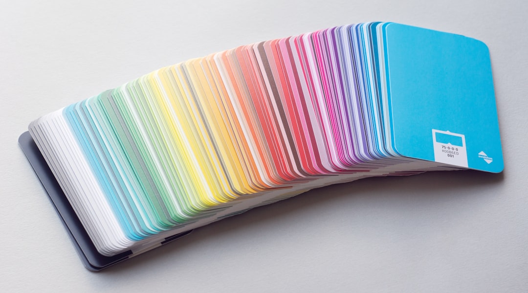
Step 3: Color Me Joyful
Color choices tell their own story. For ’42 Balloons’, the team leaned into bright but soft tones. Think:
- Pale sky blues
- Tangerine orange
- Rose pinks
- Balloony lavenders
These weren’t neon party colors. They were pastel, dreamy tones — fit for a flying circus.
Plus, they built a flexible color palette, so the logo could work on both light and dark backgrounds. Important when you’re printing banners, tickets, stickers, and cotton candy bags.
Step 4: Space to Breathe
Whitespace is the unsung hero of any great logo. It gives the viewer’s eye room to settle. For the ‘42 Balloons’ logo, spacing was given as much attention as the shapes themselves.
Too tight? It feels cramped. Too loose? It feels disconnected. The team adjusted until the logo felt like it could float on the page — graceful, not squashed.
Step 5: Layering in Meaning
Great logos tell a story. ‘42 Balloons’ tips its hat to the idea of impossible dreams — just like Larry Walters, the man who once soared into the sky with a lawn chair and 42 balloons.
In a subtle nod, the designers shaped the font’s curves to evoke upward movement. Even the negative space between letters adds to the idea of “lift.”
They also explored variations: one logo with a tiny balloon icon replacing the ‘o’, another with the numbers ‘4’ and ‘2’ becoming literal balloons.
Logo Use in the Real World
Once the design was set, it had to work in every setting:
- Posters and flyers
- Digital banners and social posts
- Merch like hats and tees
- Stamps, tickets, and badges
The team created multiple logo lockups – horizontal, stacked, monochrome, and icon-only. This let them adapt to the needs of any space or material.
Even in black and white, the charm remained intact.
Fun Extras the Team Explored
Designing ’42 Balloons’ opened the door for tons of creative exploration. Some extras:
- A looping animation of the logo rising like a real balloon
- Stickers with different colored numbers as collectible items
- An alternate logo version for children’s programming
All of these helped bring the brand down to earth — and simultaneously into the clouds.
Final Thoughts: The Logo That Floated
The ’42 Balloons’ logo wasn’t just about a typeface or shape. It was about capturing a feeling. Floating. Fun. Freedom. But just enough structure to help people follow along.
The design team blended magic with meaning. And in doing so, they made something memorable.
Good logos speak. Great logos sing. This one soars.
Key Takeaways for Your Own Whimsical Logo
- Always balance play with practicality.
- Choose fonts that smile, but still speak clearly.
- Build in flexibility. Your logo should thrive in all environments.
- Make sure your logo tells your story — even without words.
Whether you’re designing a balloon-themed festival or a bookstore for dragons, remember: a great logo floats in both the sky and the soul.
