 logo
logo


Most teams hit the same wall. The product feels solid, flows are decent, copy is workable. Then someone asks, “What are we doing for visuals?” and the room goes quiet. You can’t hire an illustrator for every screen, but you also don’t want a random mix of freebies that look like they were scraped from ten different decades.
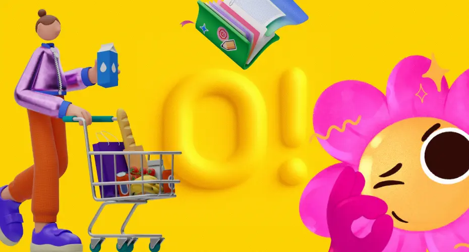
Ouch, the illustration platform from Icons8, was built for that problem. It behaves less like a pretty gallery and more like a structured source of UI‑ready artwork: vector, 3D, and animated illustrations that ship in familiar formats and consistent styles.
For web designers, UX teams, marketers, developers, educators, and small businesses trying to look competent without burning their budget on bespoke art, that’s where it earns its keep.
What Ouch Actually Is
Icons8 presents Ouch as a catalog of free and premium vector graphics, clipart, and illustrations available in PNG, SVG, and GIF. The library spans flat vectors, 3D scenes, and animated assets on transparent backgrounds, so they drop straight onto real layouts without you wrestling with white boxes or odd crops.
A few structural details matter more than the marketing slogans:
- Curated sets, not one‑off images. Styles are grouped into full families: the same line weight, proportions, and color logic across dozens of scenes. Your onboarding, dashboard empty states, error pages, and landing hero can look like parts of one product, not a collage.
- Practical formats. SVG for designers and developers who need fine‑grained editing; PNG and GIF when you want quick drops into CMSs, email templates, or social schedulers.
- Domain‑specific categories. Collections for marketing, SaaS, finance, logistics, healthcare, and education, so you’re not stretching one generic “person with laptop” graphic across every scenario.
This makes Ouch behave more like a visual component library than a random pile of illustrations. You browse by style and use case, grab what fits, then wire it into your system.
Why Illustrations Matter For UX
If you strip away the confetti, illustrations are just another layer of interface language. Done well, they support the same usability principles your UX team already cares about.
Consistent illustrations reinforce recognition: the user learns that certain characters, shapes, or metaphors belong to your product. A broken cable, an empty inbox tray, or a suitcase full of documents can explain state changes faster than a paragraph of copy. When every error, success, and empty screen uses the same style, users don’t have to ask themselves whether they’re still in the same product.
Empty states, in particular, are a good stress test. A bare blank screen looks like something failed. A well‑designed empty state, with a clear visual metaphor and one focused call to action, tells users “nothing is broken; here’s what to do next.” Ouch includes full sets of empty‑state, error, and success scenes so you can design these moments intentionally instead of improvising at the last minute.
Illustrations also help with system status. A friendly character holding a warning sign next to a short explanation feels very different from a raw “Error 500” message. You’re still surfacing the same problem, but the emotional tone changes. That difference has a direct impact on whether users retry, abandon, or complain.
Library Depth And Visual Styles
A quick scan of the Ouch catalog shows marketing scenes, product and SaaS visuals, 3D characters, minimal line illustrations, and abstract geometric sets. Icons8 positions these as production‑ready assets for real products, not just Dribbble‑ready experiments.
The strength isn’t just quantity; it’s structure:
- Domain coverage. Business, education, e‑commerce, fintech, analytics, logistics, healthcare, remote work. If you’re building a typical modern product, you’ll usually find a scene that’s close enough.
- Hierarchy‑friendly artwork. Hero‑scale compositions, mid‑weight content illustrations, and small spots live inside the same styles. That makes it easier to control visual hierarchy: big scenes for hero areas, simple icons and spots for supporting sections.
- Nuanced art direction. Some sets are playful and rounded, others sharp and minimal. There are surreal, experimental styles mixed in with conservative, “enterprise‑safe” looks.
When you treat the clipart library as design material rather than decoration, it starts to look like a backbone for your product’s visual identity, especially if hiring a dedicated illustrator is not on the table yet.
Workflow For Web And Product Designers
Designers mostly care about speed and maintainability. Ouch behaves reasonably well on both fronts.
- Design tools. SVGs drop straight into Figma, Sketch, Adobe XD, and Lunacy. Because they’re layered vectors, you can adjust colors, strokes, and composition without rebuilding the artwork.
- Design systems. Teams with component libraries can store Ouch scenes as tokens: Empty/Orders, Error/Payment, Onboarding/Step1. Illustration becomes part of the same system as typography, spacing, and icons.
- Prototyping and handoff. Lightweight vector assets keep prototype file sizes manageable, which matters when you’re pushing flows through Figma or handing specifications to engineering.
For UI/UX specialists, this is the core value: you can lock a coherent illustration style into your system early, then reuse it across new features instead of revisiting art direction every sprint.
Marketing And Social Media: Always‑On Visuals
Marketing and SMM teams work on a different cadence. They need visuals every week, often every day, and the design team rarely has time to custom‑build them.
Because Ouch serves PNG, SVG, and GIF on transparent backgrounds, marketing teams can drop artwork into CMS pages, landing builders, email tools, and social graphics without special software. A single set of scenes can run across:
- Launch landing pages and announcement emails
- Product update posts on the blog
- Social teasers on LinkedIn, Instagram, or X
- Webinar decks and one‑pagers
Using one consistent style across all of these keeps the brand recognizable even when different people are producing assets. You don’t need a formal brand book to keep things aligned; the illustration style itself carries a lot of the cohesion.
Some Ouch sets also offer 3D and motion variants, which work well for thumbnails, ad creatives, or hero sections where a static image feels too flat.
Developers: Formats, Performance, Integration
Developers never ask for “cool art.” They ask whether assets will break builds or ruin performance.
Ouch behaves like a sensible part of the front‑end stack:
- SVGs can be inlined into React or Vue components, processed by SVGO, and shared as reusable UI atoms.
- PNGs and GIFs cover environments that don’t support SVG well, such as some email clients or older CMS setups.
- Predictable file sizes mean you can keep Core Web Vitals under control, especially if you run an extra optimization pass for critical pages.
Since the same library covers both product and marketing surfaces, engineering isn’t constantly patching over visual inconsistencies between the app and the website.
Licensing, Risk, And Compliance
Random images from search engines are a legal time bomb. Ouch at least gives you clear, documented rules.
Icons8’s licensing model is straightforward: a universal multimedia license governs how you can use and modify their assets. The free tier allows commercial use with proper attribution, which is enough for prototypes, internal tools, and small side projects. Paid plans remove the attribution requirement and expand rights for more serious commercial use.
You don’t own the artwork; you license the right to use it. That’s standard for stock‑style services, and it’s what legal and compliance teams expect to see. Instead of guessing whether a file you found three years ago is safe, you point to a current license and a vendor that actually answers questions.
For agencies and businesses with approvals, this is the practical win. You can send clients a link to the license, factor the subscription into your pricing, and avoid awkward conversations about where your visuals came from.
How Different Teams Use Ouch
Different roles tap into Ouch in different ways:
- Web designers and UI/UX specialists use it to cover onboarding flows, empty states, transactional screens, and marketing pages with one coherent style.
- Marketers and SMM managers plug it into campaigns and evergreen content: product launches, feature announcements, newsletters, blog illustrations, and social graphics.
- Developers treat it as a stable asset source that won’t derail build pipelines or performance budgets.
- Educational institutions and students rely on it for coursework, internal tools, and portfolio projects that need to look like real products, not just wireframes.
- Startups and small businesses lean on it to look “designed” from day one, then gradually replace key hero visuals with custom artwork as the brand matures.
The common thread: Ouch turns illustration from a blocker into a solved problem for most everyday scenarios. You still have room for bespoke art where it moves the needle, but your baseline is “we already have something good enough to ship.”
Where Ouch Stops
There are limits you shouldn’t expect Ouch to cross.
If your brand demands a very specific art direction—editorial watercolors, ultra‑detailed technical diagrams, culturally specific narratives—stock‑like illustrations are at best a starting point. Highly regulated industries with strict visual standards may also need bespoke diagrams and icons beyond what the library offers.
In practice, Ouch works best as:
- A prototype and early‑stage tool while you refine brand direction
- Coverage for non‑hero surfaces like empty states, secondary pages, FAQs, and internal dashboards
- A backup for fast campaigns or one‑off projects when there’s no time or budget for commissioning art
Used this way, it supports design and marketing instead of replacing dedicated illustration entirely.
Short Verdict
Ouch isn’t trying to be an art museum. It’s a curated, license‑clean library of illustrations and clipart aligned with how real products and campaigns are built. If you’re the person who has to ship interfaces, slides, emails, or landing pages on a schedule, it gives you three things that actually matter: consistent styles, predictable licensing, and assets that behave well in modern tools.
That makes it worth treating Ouch as part of your design stack, not just another folder of pretty pictures.
