 logo
logo



For an ecommerce store, the product collection page often acts like a digital sales floor. It brings related products together, helps shoppers compare options, and guides them toward a purchase. When designed well, this page reduces friction, improves discovery, and supports higher conversion rates.
TLDR: A strong product collection page should be easy to scan, simple to filter, and optimized for both shoppers and search engines. It should showcase products clearly with persuasive visuals, useful sorting options, and trustworthy pricing information. The best pages balance clean design, fast performance, relevant content, and a smooth path to purchase.
Why Product Collection Pages Matter
A product collection page is usually built around a category, theme, brand, season, or customer need. Examples include women’s jackets, vegan skincare, office chairs, or holiday gifts under $50. Unlike a homepage, which introduces the brand broadly, a collection page serves shoppers who are already searching within a specific area.
Because these visitors often have stronger buying intent, the page must help them move quickly from browsing to decision-making. A confusing layout, weak filters, slow loading speed, or unclear product information can cause shoppers to leave before they ever reach a product detail page.
Use a Clear and Helpful Page Structure
The best collection pages begin with a clear structure. Shoppers should instantly understand what the page offers and how to explore it. A concise heading, short introductory text, organized product grid, and visible filtering options can make the experience feel intuitive.
The page title should be specific and descriptive. Instead of a vague label like Collection, a page should use terms such as Men’s Running Shoes or Minimalist Home Office Desks. This improves usability and also helps search engines understand the page topic.
A short paragraph near the top can explain the collection, highlight key benefits, and include relevant keywords naturally. However, this content should not push products too far down the page, especially on mobile devices.
Make Product Cards Easy to Scan
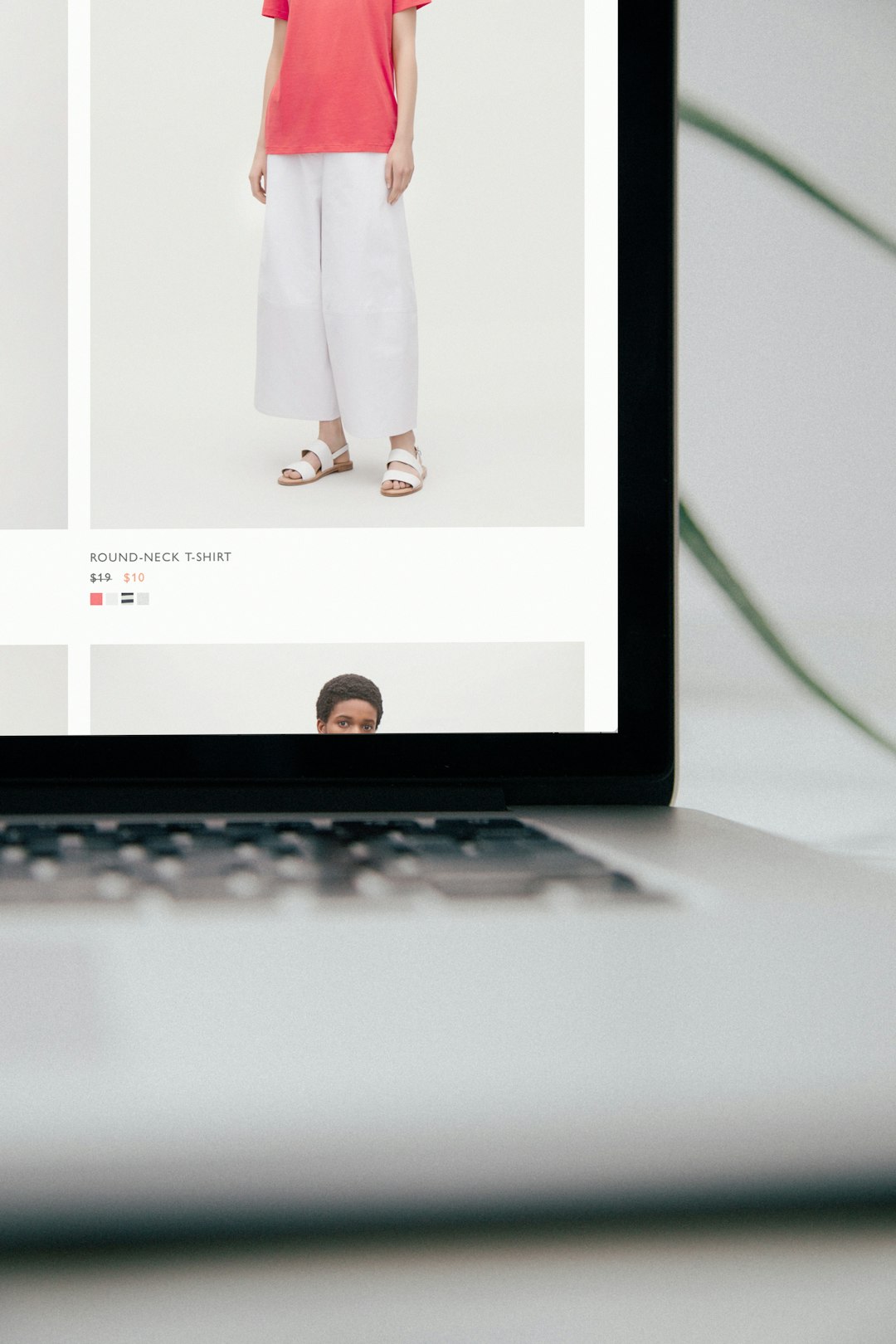
Product cards are the core of a collection page. Each card should help shoppers compare products without needing to click into every item. A strong product card typically includes:
- High-quality product image that shows the item clearly
- Product name that is readable and descriptive
- Price, including sale price when relevant
- Ratings or reviews if available
- Color, size, or variant indicators for quick comparison
- Badges such as New, Bestseller, or Low Stock
Images should be consistent in style, size, and background. When product photography varies too much, the page can feel messy and less trustworthy. Hover effects, secondary images, or quick-view options can also help shoppers inspect products faster, though these features should not slow the page down.
Provide Smart Filtering and Sorting
Filtering is one of the most important features on a collection page, especially for stores with large catalogs. Shoppers should be able to narrow choices by the attributes that matter most to them. These may include size, color, price, brand, material, rating, availability, fit, style, or product type.
Filters should be relevant to the collection. A skincare page might need filters for skin type and ingredient preferences, while a furniture page may need filters for dimensions, material, and room type. Irrelevant filters make the experience feel generic and increase friction.
Sorting options are also essential. Common sorting choices include:
- Featured
- Best selling
- Price, low to high
- Price, high to low
- Newest arrivals
- Highest rated
On mobile, filters should be easy to open, apply, and clear. Sticky filter buttons and visible active filter tags can make the experience smoother.
Optimize for Mobile Shopping
Many ecommerce visitors browse collection pages on mobile devices, so the layout must be designed for smaller screens. Product images should remain large enough to evaluate, buttons should be easy to tap, and filters should not overwhelm the screen.
A two-column grid often works well on mobile, though some luxury or image-led brands may prefer a single-column layout for stronger visual impact. The best choice depends on the product type, audience, and browsing behavior.
Mobile performance is equally important. Large images, excessive scripts, and unnecessary animations can slow loading speed. A slow collection page can reduce conversions and damage search visibility. Images should be compressed, lazy loading should be used carefully, and the page should remain responsive under real-world network conditions.
Use Merchandising Strategically
Collection pages are not only organizational tools; they are also merchandising opportunities. Products should be arranged in a way that supports business goals and customer needs. Bestsellers, high-margin items, seasonal products, and new arrivals may deserve higher placement.
However, merchandising should still feel helpful rather than manipulative. If shoppers expect a collection to show the most relevant products first, the page should not bury popular or highly rated items behind less suitable products. Data from search behavior, purchase history, inventory levels, and conversion rates can guide smarter product ordering.
Badges can also influence decisions when used honestly. Labels such as Bestseller, Eco Friendly, Limited Edition, or Free Shipping help shoppers identify value quickly. Too many badges, however, can create visual clutter and reduce their impact.
Support SEO Without Hurting Usability
Product collection pages can attract valuable organic traffic when optimized properly. Each page should have a unique title tag, meta description, heading, and relevant on-page copy. The content should describe the collection naturally and answer common buying questions.
Internal links can help both shoppers and search engines. A collection page may link to related categories, buying guides, featured brands, or seasonal edits. For example, a page for winter coats could link to scarves, boots, and a guide on choosing insulated outerwear.
Technical SEO also matters. Clean URLs, proper canonical tags, indexation control for filtered pages, and structured data can help prevent duplicate content issues. Stores with many filter combinations should pay close attention to which pages search engines can crawl and index.
Build Trust and Reduce Uncertainty
Shoppers are more likely to continue when a collection page answers basic concerns early. Visible pricing, sale labels, shipping messages, return information, and stock status can reduce hesitation. If free shipping or easy returns are important selling points, they should be displayed near the product grid or in a subtle banner.
Review stars and user-generated content can provide social proof. Even a small rating display on product cards can help shoppers compare options. For products where fit, size, or performance is important, collection-level guidance can also improve confidence.

Measure and Improve Continuously
A collection page should not be treated as a one-time design task. Ecommerce teams should monitor performance and improve the page based on data. Useful metrics include click-through rate to product pages, filter usage, add-to-cart rate, conversion rate, bounce rate, scroll depth, and revenue per visitor.
A/B testing can reveal whether changes such as larger product images, different sorting defaults, new filter labels, or promotional banners actually improve results. Customer support questions and on-site search data can also reveal missing filters, unclear category names, or product information gaps.
FAQ
What is a product collection page in ecommerce?
A product collection page is a page that groups related products by category, theme, brand, season, or customer need. It helps shoppers browse and compare multiple products in one place.
How many products should appear on a collection page?
The ideal number depends on the catalog and user experience. The page should show enough choices to support browsing, while using pagination, infinite scroll, or load-more buttons carefully to avoid overwhelming shoppers.
What are the most important elements of a collection page?
The most important elements include a clear heading, strong product images, readable product cards, useful filters, sorting options, fast loading speed, mobile-friendly design, and trust signals.
Should collection pages include text for SEO?
Yes, but the text should be concise, relevant, and helpful. It should support the shopper’s decision while giving search engines useful context about the products on the page.
How can an ecommerce store improve collection page conversions?
An ecommerce store can improve conversions by simplifying navigation, improving filters, using better product images, showing reviews and pricing clearly, optimizing for mobile, and testing layout changes with real user data.