 logo
logo



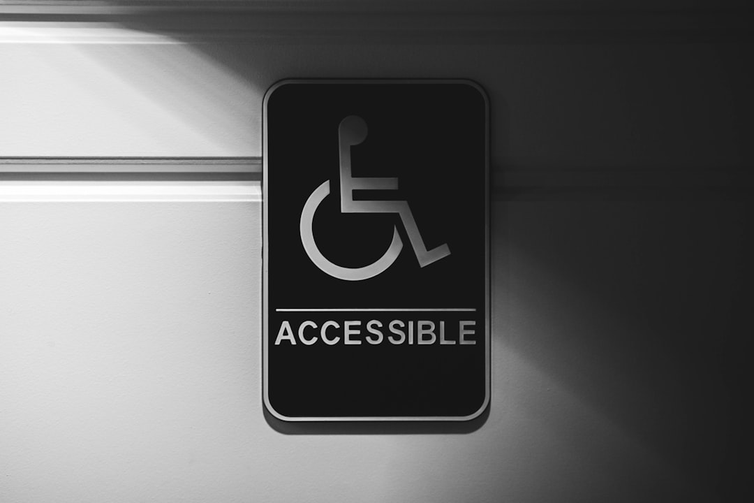
Your website is like a front door. Everyone should be able to open it. That includes people using screen readers, keyboards, captions, zoom tools, older phones, slow Wi Fi, or just tired eyes at 11 p.m. The good news? Making a site more inclusive is not magic. It is a set of small, smart choices.
TLDR: Inclusive websites are easier for everyone to use, not just people with disabilities. Start with clear text, strong color contrast, keyboard support, captions, and simple forms. For example, an online shop that added better button labels and larger form fields saw checkout errors drop by 28% in one month. Small fixes can make a big difference fast.
What does an inclusive website mean?
An inclusive website welcomes many kinds of people. It works for users with different bodies, brains, devices, languages, and internet speeds.
Think of it like a good party. The music is not too loud. The snacks are labeled. There is a ramp at the door. People know where the bathroom is. Nobody feels lost.
Your website can do the same thing.
Inclusive design means you plan for real humans. Not perfect humans. Real ones. Busy parents. Color blind users. People with shaky hands. People with dyslexia. People who do not speak your language well. People using a cracked phone screen on a bus.
Start with plain, friendly words
Simple writing is a superpower. It helps users move faster. It also helps people who use translation tools or screen readers.
Use short sentences. Avoid jargon. Say what you mean.
Instead of this:
“Initiate the authentication process to access your user dashboard.”
Try this:
“Log in to your account.”
Much better, right?
Here are quick writing tips:
- Use common words.
- Put the most important idea first.
- Break long text into small chunks.
- Use headings that describe the page.
- Make link text clear. Use “Download the menu,” not “Click here.”
Make colors easy to see
Color is fun. But color alone should not carry meaning.
If your form says an error field is “marked in red,” some users may miss it. Add text too. Add an icon. Add a clear message.
Contrast matters as well. Light gray text on a white background may look fancy. It is also hard to read. Especially on sunny days. Especially on older screens. Especially for many people over 40.
Try tools like:
- WebAIM Contrast Checker for testing text and background colors.
- Stark for checking contrast in design files.
- Accessible Colors for finding better color pairs.
A simple rule: if users need to squint, the design needs help.
Help keyboard users move around
Not everyone uses a mouse. Some people use a keyboard. Some use switches. Some use voice control. Your site should still work.
Try this test. Open your site. Put your mouse away. Press the Tab key. Can you move through menus, buttons, forms, and links? Can you see where you are?
If the focus outline is missing, bring it back. That glowing box or border is useful. It is like a “you are here” sign.
Make sure users can:
- Open menus with the keyboard.
- Close pop ups with the keyboard.
- Submit forms without a mouse.
- Skip repeated navigation with a “Skip to content” link.
Fun fact: Keyboard testing often reveals bugs that mouse users also face. So it helps everyone.
Add alt text that actually helps
Alt text describes images for people who cannot see them. It is read aloud by screen readers. It also appears when images fail to load.
Good alt text is short and useful. It explains the purpose of the image.
Bad alt text:
“Image123 final final.”
Good alt text:
“Woman comparing two coffee makers on a product page.”
If an image is only decorative, it may not need detailed alt text. But if it teaches, sells, explains, or guides, describe it.
Make videos and audio more welcoming
Videos need captions. Audio needs transcripts. This helps deaf and hard of hearing users. It also helps people watching in noisy places. Or quiet places. Like a library. Or a bedtime scroll next to a sleeping baby.
Good captions include speech and important sounds. For example:
“Doorbell rings.”
“Soft music plays.”
Useful tools include:
- YouTube captions, then edit them for accuracy.
- Otter.ai for draft transcripts.
- Descript for editing audio and text together.
Do not rely on auto captions alone. They can turn “brand strategy” into “bread tragedy.” Funny, yes. Helpful, no.
Design forms that do not make people cry
Forms are where many websites lose users. They can be confusing, tiny, picky, or rude.
An inclusive form is calm. It tells users what to do. It explains errors clearly. It does not blame them.
Instead of:
“Invalid input.”
Say:
“Enter your phone number with 10 digits.”
Better, right?
Try these form tips:
- Put labels above fields, not only inside them.
- Use large click areas.
- Explain required fields.
- Show errors next to the problem field.
- Let people review before they submit.
- Do not erase all answers after one mistake.
Also, allow names from many cultures. Not everyone has a first name and last name in the format you expect. Avoid strict rules unless you truly need them.
Support different screen sizes and zoom
Many users zoom in. Some need large text. Some use small phones. Your layout should bend, not break.
Test your site at 200% zoom. Can you still read it? Can you still use the menu? Does content overlap? Are buttons still visible?
Use responsive design. Avoid fixed text sizes that trap users. Let the page flow.
Also check tap targets. Tiny buttons are annoying. They are even harder for users with tremors, large fingers, or motor disabilities.
A good target size is around 44 by 44 pixels or larger. Your thumbs will celebrate.
Think about neurodiverse users
Some users have ADHD, autism, dyslexia, anxiety, migraines, or memory challenges. A busy page can feel like a disco ball in a thunderstorm.
Keep things steady and clear.
- Avoid flashing content.
- Let users pause moving banners.
- Use simple layouts.
- Keep navigation consistent.
- Do not start audio or video automatically.
- Use enough spacing between lines.
Give users control. Let them choose. That is a key part of inclusion.
Test with real tools
You do not have to guess. There are many tools that can spot issues.
Try these:
- WAVE to find accessibility problems on web pages.
- axe DevTools for browser based checks.
- Lighthouse in Chrome for quick audits.
- NVDA, a free screen reader for Windows.
- VoiceOver, built into Apple devices.
Automated tools are helpful. But they are not enough. They can catch missing alt text. They cannot always tell if the alt text is useful. They can flag low contrast. They cannot tell if your tone is confusing.
So mix tool testing with human testing.
Ask real people to try your site
This is the part many teams skip. Please do not skip it.
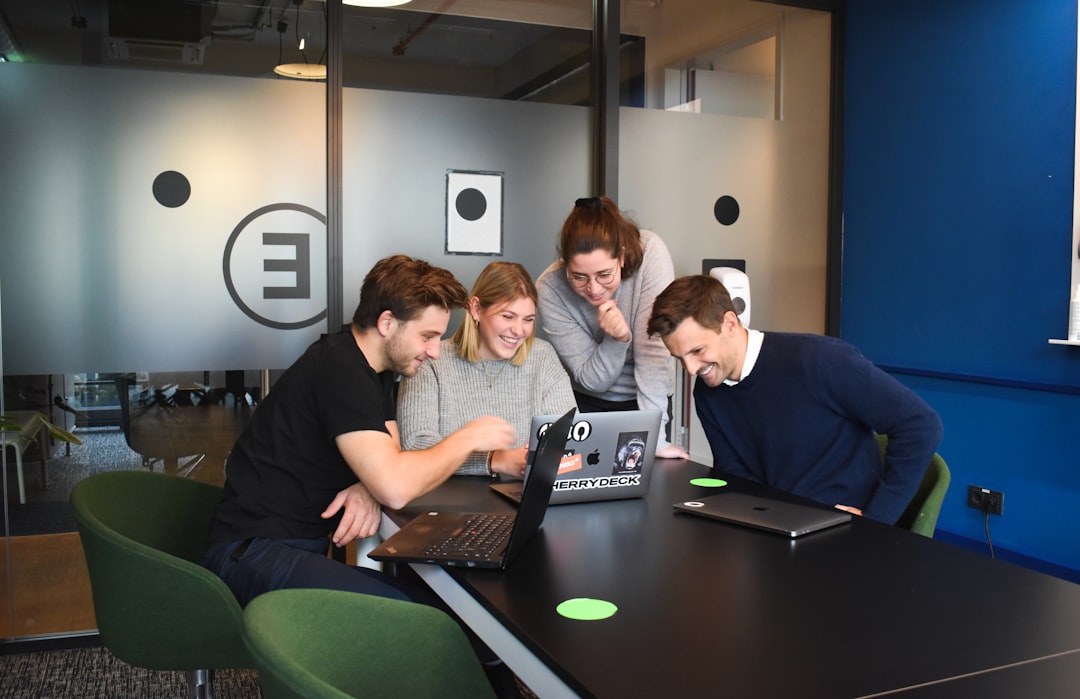
Invite people with different needs to use your website. Watch where they struggle. Ask what felt easy. Ask what felt annoying. Then fix what you learn.
You do not need a giant lab. Start with five users. Give them simple tasks. For example:
- Find the return policy.
- Sign up for the newsletter.
- Buy one product.
- Contact support.
Look for patterns. If three out of five people miss the same button, the button is the problem. Not the people.
Create an inclusion checklist
Make inclusion part of your routine. Do not leave it for “later.” Later is where good ideas go to nap forever.
Use a basic checklist before every launch:
- Is the text clear?
- Do images have useful alt text?
- Is color contrast strong?
- Can the site work with a keyboard?
- Do videos have captions?
- Are forms easy to understand?
- Does the layout work on mobile and zoom?
- Did at least one real user test it?
Make it a team habit
Inclusive websites are not built by one hero with a checklist cape. They are built by teams.
Writers choose clear words. Designers choose readable layouts. Developers build strong code. Marketers avoid confusing pop ups. Leaders give time and budget.
Everyone has a role.
Celebrate wins too. If your bounce rate drops after improving readability, share it. If support tickets fall after fixing forms, cheer loudly. Inclusion can be kind and good for business.
Final thought
Making your website more inclusive is not about being perfect. It is about being thoughtful. Start small. Fix one page. Improve one form. Add captions to one video. Then keep going.
The web should feel like an open door, not a locked gate. With the right tools and habits, your site can welcome more people. And that is good design.