 logo
logo


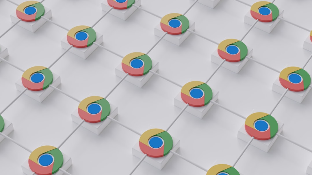
Have you ever looked at a logo and wondered why it just feels “right”? Often, that perfection isn’t by accident—it’s carefully crafted using a logo grid system. These grids incorporate precise geometry, proportional ratios, and thoughtful alignment to produce logos that are balanced and visually compelling. Grids help unify aesthetic principles across a brand’s visuals and ensure that every element serves a purpose.
TL;DR: Logo Grid Systems Explained
A logo grid system uses geometric frameworks—such as circles, triangles, and mathematical ratios—to guide the construction of logo shapes and layouts. These systems go beyond aesthetic appeal, playing a crucial role in achieving harmony and consistency. Whether it’s using the Golden Ratio or concentric circles, designers turn to these grids to ensure logos communicate clarity and confidence. Understanding how these systems work can enhance both your design eye and your brand quality.
What is a Logo Grid System?
A logo grid system is a set of guiding lines and shapes that serve as the foundation for creating logos. These grids provide structure, helping designers maintain alignment, spacing, and proportional relationships. They are particularly useful when trying to scale designs, maintain symmetry, or replicate consistent visuals across different mediums and formats.
Grids allow for:
- Precise spacing and alignment between elements
- Consistent proportions, ensuring cohesive visual language
- Balanced composition that remains appealing at any size
The Geometry Behind Logos
Shapes play a major role in logo creation, and the use of circles, triangles, and rectangles is not just for appearance but for their underlying significance and structure. Let’s break down how three key shapes fit into grid systems and influence logos:
1. Circles: The Foundation of Symmetry
Circles are often used to create a sense of unity, continuity, and perfection. They are also the most common geometric shape in grid-based logos. Designers may place multiple concentric or overlapping circles on the grid to help align elements or to suggest motion and cohesion.
One famous example using circular grids is the Twitter logo. The bird is constructed from several intersecting circles, giving it a fluid, organic look while maintaining precision.
- Why use circles? They suggest softness, movement, and wholeness.
- How they help: Circles allow designers to round corners, measure spacing, and ensure natural curvature within a logo.
2. Triangles: Direction and Stability
Triangles, with their sharp angles and directional lines, are useful when designers want to create logos that suggest movement, energy, or stability. An upward-pointing triangle can symbolize growth or ambition, while downward-pointing ones might indicate a grounded or stable presence.
Although triangles are less common than circles in grid frameworks, they provide strong visual anchors. They can guide the eye and add dynamic tension to a composition, especially when used to construct letterforms or angled elements.
- Use case: Logos wanting to display futuristic elements or directional movement benefit from this shape.
- Visual energy: Triangles introduce contrast to otherwise soft, circular designs.
3. Ratios and Proportions: The Mathematics of Beauty
Perhaps the most fascinating part of logo grid systems is the use of mathematical ratios. Chief among these is the Golden Ratio—approximately 1.618. Used in everything from architecture to art, it’s believed to be aesthetically pleasing to the human eye. In logo design, the Golden Ratio can dictate the size relationships between elements, guiding designers toward compositions that “just feel right.”
Other common ratios used include:
- 1:1 – a perfect square or circle, representing balance
- 2:3 or 4:5 – adds asymmetry while keeping harmony
- Fibonacci sequence – builds up circular grids often used in organic and tech logos
Why Use a Grid? More Than Just Looks
Many assume grids are restraining, but quite the opposite is true. Logo grids offer freedom within structure. Once you understand the framework, it becomes a powerful tool to develop logos that are timeless and scalable. Think of them like blueprints—they don’t dictate creativity; they support it.
Some of the core benefits include:
- Scalability: Grid-based logos maintain integrity at any size, from billboards to favicons.
- Consistency: Brands expanding into products, websites, and ads rely on logo consistency across all touchpoints.
- Professionalism: A well-structured logo instills trust and confidence in your audience.
Famous Logos Created with Grids
Multiple brands have utilized grid systems to create their iconic logos. These include:
- Apple: Circular-based grid creating the iconic bitten apple.
- Pepsi: Used Fibonacci sequences and arcs to reshape their global brand identity.
- Twitter: Composed entirely of overlapping circles, giving the bird its smooth, precise look.
Many brand guidelines today even include the original logo grid, showcasing how these geometric tools continue influencing branding decisions well past the initial design phase.
Tips for Creating a Logo Using a Grid System
If you’re ready to build your own logo using a grid system, keep these tips in mind:
- Start with basic shape exploration. Break down your design into simple geometric components (circles, lines, arcs).
- Establish ratios early. Frame your key components using ratios such as 1:1 or 1:1.618.
- Align with purpose. Every grid line should serve to align or proportion a specific part of the logo, not just decorate the background.
- Refine with symmetry. Check vertical and horizontal symmetry, adjusting elements to find balance—even in asymmetrical designs.
- Test scalability. Ensure your logo reads well at small sizes. If the grid was used well, it should retain its legibility and clarity.
There Are No Rules—Only Tools
While grid systems are powerful tools, they are not mandatory requirements. Many designers create stunning logos without ever touching a circle or Fibonacci spiral. But understanding how these systems work gives you a broader, more sophisticated design vocabulary. Using a well-thought-out grid can elevate a project from looking amateur to looking expertly crafted.
Remember: grids don’t limit creativity. They support it.
Final Thoughts
Logo grid systems—whether centered on circles, triangles, or mathematical ratios—provide designers with a reliable method for achieving precision and harmony. They’re the invisible scaffolding behind the world’s most recognizable marks and a critical part of the design toolbox.
Whether you’re a new designer or a seasoned veteran, leveraging grids can transform your design process. With a balance of form and function, logic and intuition, logo grids just might be the secret weapon you didn’t know you needed.
